There are several tools on the market to test your website on accessibility. Some are free, some are paid. At the same time, some checker platforms offer both free and paid features. But do you have to rely on a tool or brand before you understand your site’s level of compliance? Not really. Today, you can successfully check the website accessibility yourself and fix some basic violations.
The truth is, fundamental compliance issues are what any average person — including you — can successfully handle when they have a well-defined manual to follow. In a bid to give you a head start in your compliance effort, we have compiled a list of important checkpoints to self-check your site for accessibility.
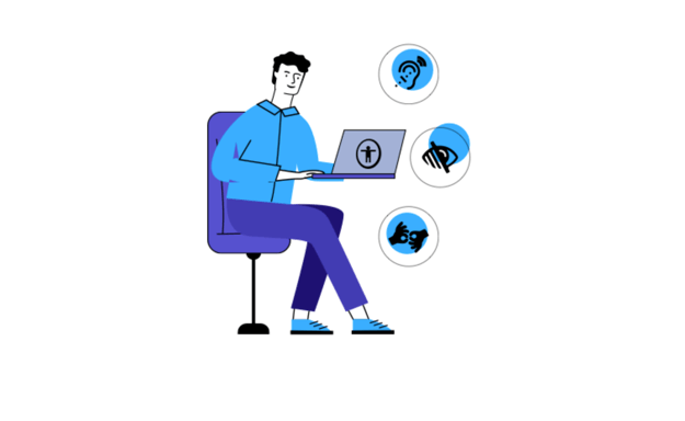
A comprehensive way to self-check your website is to consider the broad aspects of disabilities: visual, audio, physical, cognitive, and speech disabilities. Each of these disabilities types have unique requirements while they also share several concerns. For example, following a discernible content structure, writing in plain English, and using readable fonts will affect almost all disabilities. Similarly, ensuring that the site is keyboard accessible and has alt texts for non-text content will produce positive outcomes across the board. In specific terms, the following are important items to tick on your compliance inventory.
9 Things to Consider when Self-checking your Website
1. Ensure web content is readable and well-structured
First things first, does your website look neat? Can users easily discern information on your site, or are the pages filled with cramp fonts? The first impression users record with your site is your homepage. Therefore, the first point of call in your self-check is your home page arrangement, which should contain clear information conveyed in readable fonts. Not only the homepage, though, but you should also strive to replicate this standard on other pages.
In a specific survey, people with disabilities were asked about the major barriers when completing an online purchase. Among the points shared by respondents, the top 5 accessibility issues are not technical but rather design or copywriting-related. So that visitors to your site will not have irritating experiences, you should:
- Break texts into sections and under headings
- Use plain English
- Do not write headlines all through in capital
- Use readable fonts such as San serif fonts, Verdana, Open Sans, etc.
- Ensure that text can be magnified (zoomed) up to 200%
2. Check for alternatives text for non-text content
A picture indeed speaks a thousand words, but not everyone can see it. How do we cater to the need of this category of people? The answer is simple, by providing alternative text descriptions.
Alternative text (also known as alt text or alt description, or alt attributes) is a description that accompanies non-text content. Images are the most common examples of non-text elements requiring alternative descriptions so that screen-reading software can interpret the visually impaired information. Interestingly, alternative texts perform beyond this function. It is a good boast for the SEO score. Additionally, it functions as stand-in content, conveying full information in the event of a site not fully loading.
3. Use enough contrast, but do not overuse
Contrast use is an aspect of visual accessibility that you should include in your checklist. Color contrast is the difference in light between the font and its background. Moderate contrast between text and background enhances content readability for everyone, including people with low vision.
Vision impairment is a public health disaster. According to the World Health Organization, about 1 billion people live with some form of vision impairment. Your website must conform to the minimum World Content Accessibility Guidelines 2.1 requirements to accommodate this group of people. An excellent way to determine contrast is by measuring it against the background over which the text occurs. If, however, there is no background color, it is assumed that the background is white.
For the Level AA accessibility score, the minimum WCAG 2.1 contrast requirement is 4.5:1. By extension, this rule applies to placeholder text and text that pops up when an object has a keyboard focus. Each of these requires sufficient contrast if present.
Meanwhile, there are exceptions to this benchmark, especially if your site has larger texts. Texts with larger and wider characters are easier to read and, thus, require lower contrast. So, if you used large texts on your site (which should be at least 18 points or 14 points bold), you could cut down to at least a 3:1 ratio. Also, texts that form a part of a logo or brand name are free from this general rule.
4. Ensure your site is keyboard navigable
Can users move from your home page to the next page without dragging their mouse? Bravo, if they can. However, if they cannot, you have a big vacuum to fill. For this reason, you must work on your keyboard accessibility.
Keyboard accessibility refers to the level of ease with which users can navigate your site using a keyboard only. When people explore the web without the mouse, they rely on Tab and Shift-Tab keys to move from one location to another. Keyboard accessibility is a fundamental aspect of web accessibility because it provides access to people, who due to motor disability, cannot use the mouse. Also, the majority of blind users depend on keyboard functionality to surf the web, the same way most screen readers rely on tab navigation. As a result, you must check that every link, feature, and control users access with the mouse are accessible by keyboard.
Furthermore, there should be a clear visual indicator that shows users that an item has keyboard focus so that visitors can know where they are on the web or which command they are about initiating. Also, making your site keyboard friendly involves providing users the opportunity to select options from drop-down menus and complete and submit online forms.
5. Check your website accessibility forms are easy to fill
Form filling is a common difficulty people encounter when using your site, especially if they have a certain disability or rely on a keyboard or assistive technologies. Meanwhile, firms have become almost impossible to do away with. It would be best if you designed from well and labeled fields, preferably with visible text. Besides, it also helps to allow auto-fill.
6. Use the right content management system
Content management system (CMS) such as WordPress, Drupal, etc. Although some of these platforms facilitate accessible websites, you are responsible for the site theme and its effect on your site.
7. Provide alternative media for multimedia (audio and video) content
Welcome videos on the homepage have become a common practice for website owners. As much as it is a good way to welcome visitors to your website, videos could work against you if you do not provide text alternatives (transcript or caption) for them. An important success criterion for auditory accessibility is that multimedia content should not start automatically and include control mechanisms.
8. Check for flashing content and distracting images
Flashing or flickering online content can cause seizures in sensitive people. Because of this, flashing content should be prevented. To stop using content that flickers overall is the best strategy to solve this issue. Not only can it trigger epilepsy seizures, but for website users in general, it is known to be adapted as irritating or disruptive. If you need to use content that flashes or flickers because for some reason, use these tools to test your content to guarantee that your content flashes at a secure level. The standard is, it is expected to be dangerous if the content flashes for more than three seconds. Another flash checking tool provided by W3C is measuring general flash and red flash thresholds; this tool is a more reliable technical formula.
9. Make link text distinct and accessible by screen reader
Users of screen readers have limited ways to browse and search a webpage quickly. One of the most common ways to easily navigate a page is to extract a list of links and determine the content and where to navigate from there. Optionally, screen readers search a website by alt-tab a link to a link from a link (without reading the in-between text on the page). These methods are pointless with a lot of ‘Press here to download’ and ‘Read more on…’. When you think about websites and webpages on smartphones and tablets, the linked text becomes a significant problem.
3 tools to help you check your website accessibility
While it is possible to check many compliance and accessibility issues on your website by yourself, you can improve your result by incorporating some tools in the process. Following best practice, it is advisable to begin your website audit with an automated check. This is because an automated audit speedily detects violations and free up productive time that would have wasted pointing out minute issues. Take a look at these 3 tools to help you check your website accessibility today:
1. aCe
aCe, by accessiBe, is a quick automated scanner that scans for website accessibility according to international legislation, including the WCAG 2.0, ADA, Section 508, EAA/EN301549, and ACA/AODA. You can rely on aCe’s elaborate and comprehensive audit report to begin or complete your effort. The tool is free, offers suggestions for remediation, and supports multiple scanning. However, all you get is a homepage scan and nothing more.
2. WAVE Checker
Robust, lightweight, and extremely fast, WAVE is another free online accessibility checker that can be of immense help to you. With WAVE Checker, you can run an entire site check (if you have the time and stamina), multiple free scans, check for contrast and page structure, and Arial labels.
3. SiteImprove
Siteimprove is a fantastic automated scanner that can help you conduct automatic and semi-automatics checks on your site. Siteimprove is an online tool with free functionality to get you started.
To conclude
With the right information and amount of dedication, anyone can check their website’s accessibility and compliance level—including you. As you can see, the processes are very simple and require little or no technicalities. That said, your effort may not guarantee 100% compliance. There are technical aspects that require a deep knowledge of programming. Besides, some minute details require an automated check to detect before fixing with human effort. Combining your human effort with some of the tools we have mentioned will give a better result in the long run.


